Poster design for Berwaldhallen, created as part of a school project. The goal was to create a concept that better connects with a younger generation through bold and modern design.
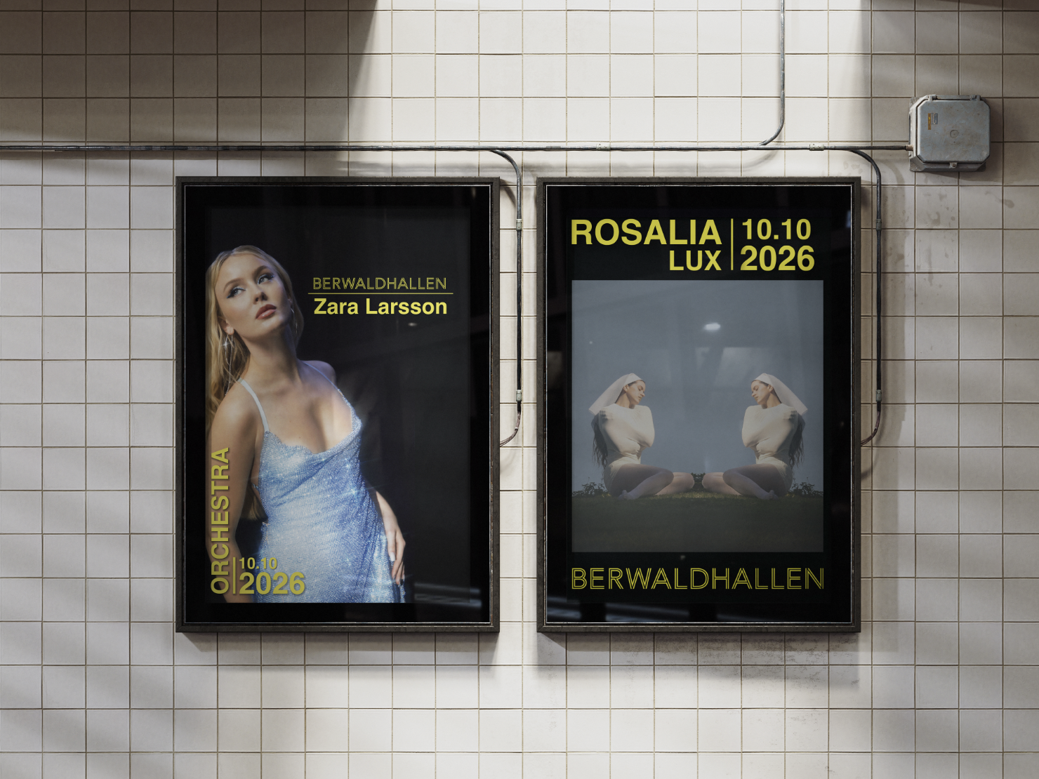
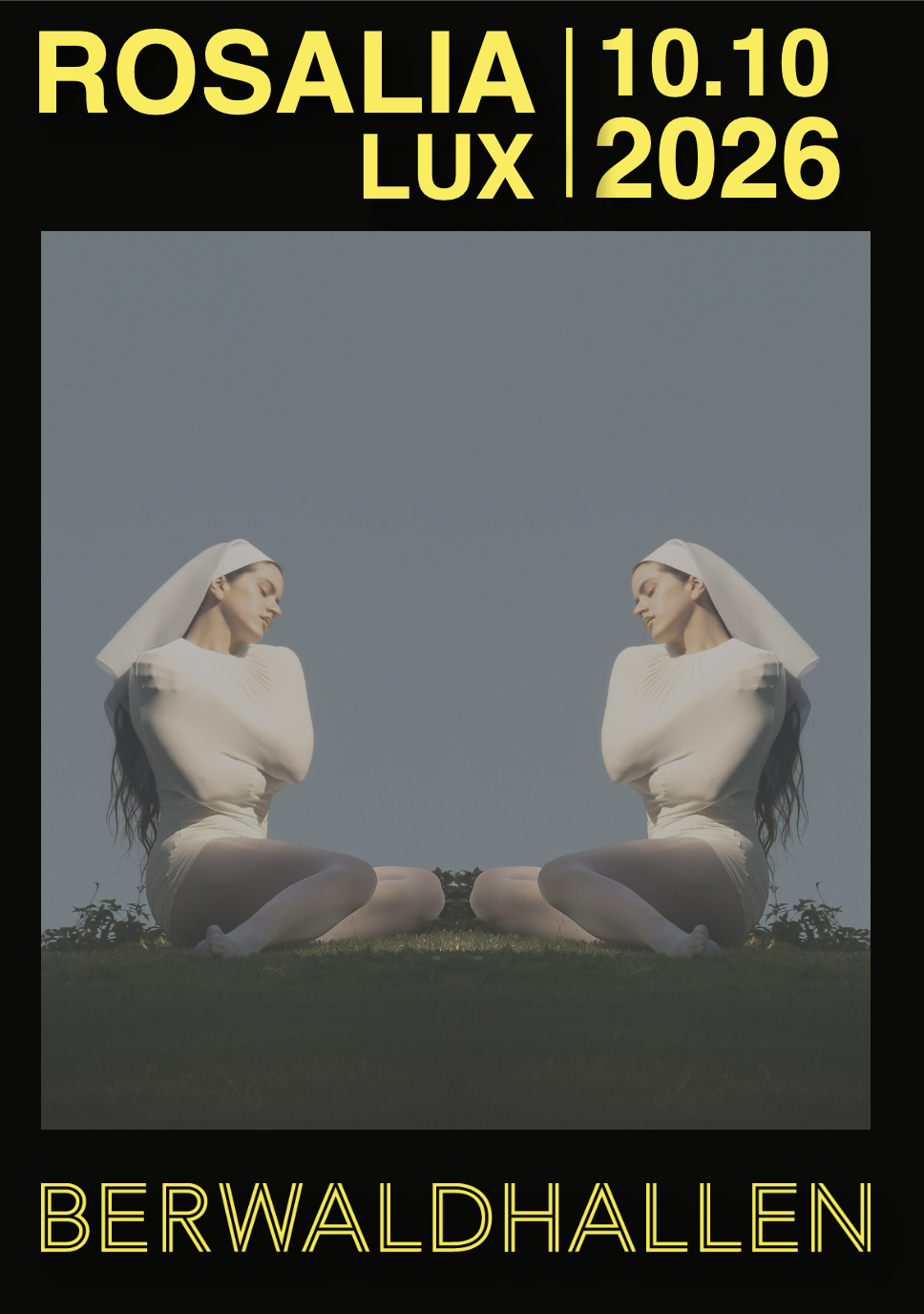

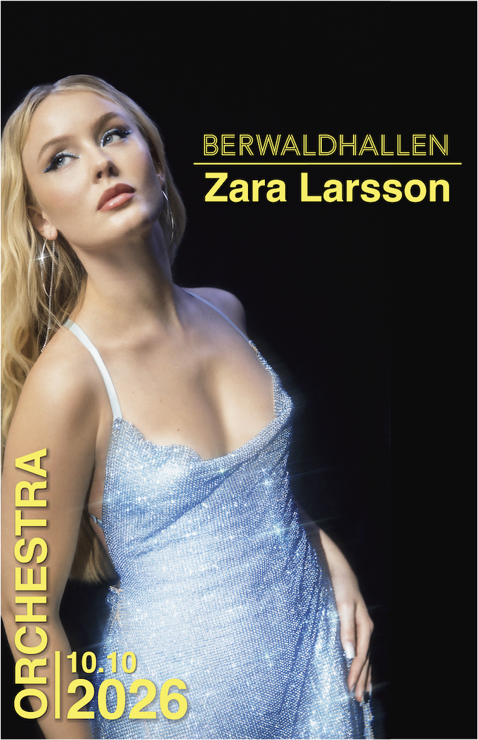

The posters were designed using a structured grid system and bold typographic hierarchy to create a clear and recognizable visual identity. Helvetica Bold was used throughout the project for its clean and structured expression, connecting to the exhibition’s theme of perfection and precision.
The yellow was chosen to create strong contrast against the dark backgrounds and make the typography stand out across both print and digital formats. Large-scale typography, image cropping, and varied compositions were used to create movement throughout the poster series while keeping the identity consistent.