Barrier - Packaging
Barrier is a conceptual skincare brand created as part of a school project focused on designing something we felt was missing in the market. The project explores a softer and more visually elevated approach to eczema-focused skincare, moving away from the typical clinical aesthetic.

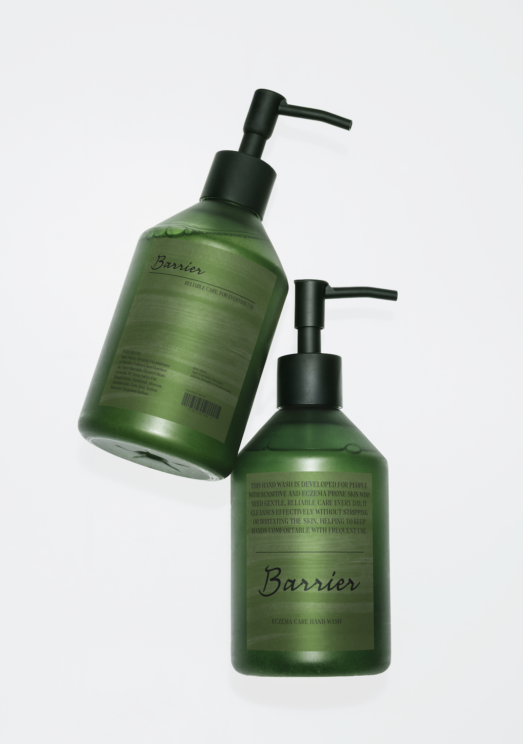


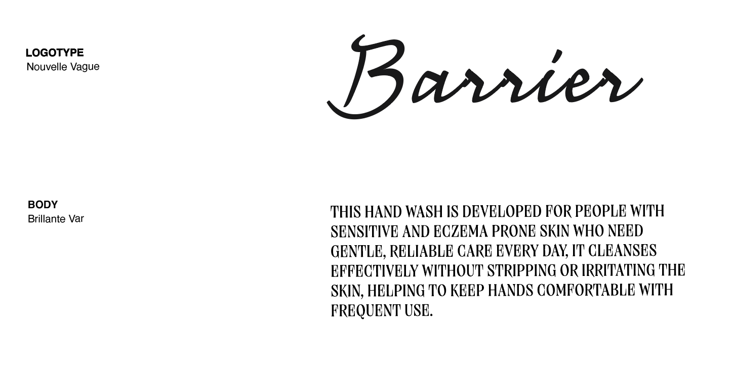
The visual identity focuses heavily on typography, layout, and color to create a calm but expressive feeling. The logo uses the typeface Nouvelle Vague, paired with Brillante Var for the body text to create contrast between softness and structure. Through minimal layouts and muted green tones, the project aims to make sensitive skincare feel both comforting and visually appealing.